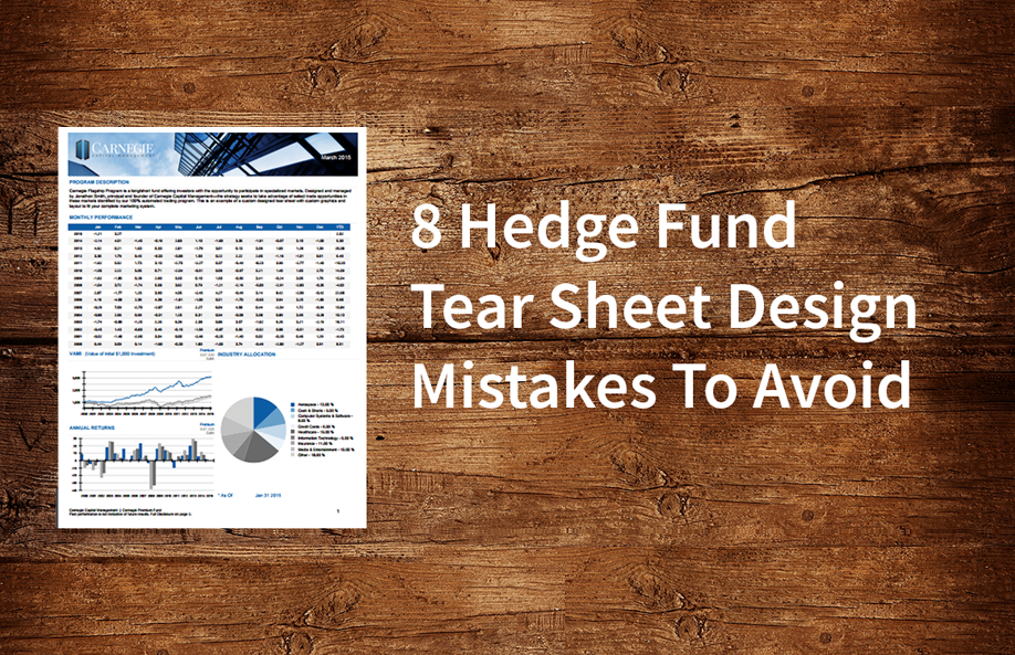
8 Hedge Fund Tear Sheet Design Mistakes to Avoid

Fund tear sheets are designed to highlight your performance and provide just enough information to get a potential investor to learn more about your fund or investment program.
With that mind, fund tear sheet design alone will not seal the deal. Display your performance and briefly cover what your fund strategy is and why it’s unique. The goal is not to get an allocation on the spot—but to set up a call or meeting to further explain your strategy, and answer an investor’s questions.
At Gate 39 Media we design tear sheets and other marketing materials for funds, CTAs, RIAs, and family offices. Our unique Clarity Tear Sheet Designer provides a way for managers to generate their own tear sheets monthly using our online application. From our experience in working with fund administrators, compliance firms, allocators and asset managers, here are 8 mistakes to avoid in designing your fund tear sheet.
- No contact information At a CTA Expo event, I saw co-founder Frank Pusateri hold up a stack of tear sheets and list mistakes fund managers make. Missing contact info was near the top. “No way,” I thought. Sure enough, I promptly met a manager without an email address, phone number, or website on their tear sheet.
- Too much information Provide a general overview and background of the strategy and perhaps the firm and/or manager, and just enough data. A few short sentences each tops. This isn’t your pitch book, PPM, or disclosure document—the idea is to provide just enough info to create interest and get a meeting.
- Missing key information Yes, you do need to include your fees and other key data on your tear sheet. No matter how amazing your fund may be, every investor expects to see fees clearly stated on a funds tear sheet. Leaving this information off is likely to turn off a professional allocator, and is a potential compliance issue.
- Using a database report as a tear sheet Databases are for investors to do research and each printed report includes pages of information for each fund that go beyond what you need to start a conversation. Using databases (with the database logo and contact info) as your primary tear sheet displays a lack of capital and care in your business.
- Too many benchmarks Unless you have a compelling reason, stick with just two benchmarks. Crowding a tear sheet with indexes that are not investible and “easy to beat” clutters up your tear sheet with unnecessary data.
- Showing gross returns Displaying gross and net returns does not make your returns seem higher. Instead, it reminds the investor of your fees. And no, you can’t show just gross returns.
- Mixing hypothetical and actual returns To show a longer track record, new managers want to combine hypothetical and actual returns. Even if you are trading exactly as back tested, you can’t simply highlight or note the hypothetical portion of the returns. The ratios and stats shown combine hypothetical and actual returns and not just the actual returns, rendering your data inaccurate and exposing your fund to compliance issues. Instead, create two separate tear sheets—one for hypothetical and one for actual returns, and in 6-12 months you’ll no longer need the hypothetical returns.
- Amateurish or ugly design The professionalism with which you brand and lay out your tear sheet (and other marketing materials), reflects the care, accuracy, and attention to detail you display in managing your fund and your client’s money. Design counts.
The professionalism you put into your fund presentation is a reflection of how you manage your business and investor money. Your fund’s tear sheet is a core tool in any fund manager’s tool box—follow these fund tear sheet design tips to keep your tools sharp.
Contact Gate 39 Media to learn more about our process and view our tear sheet options and design samples.
—–
Shane Stiles is President of Gate 39 Media, a financial services marketing firm providing online marketing and application development for financial services across futures, equities, alternative investments and insurance.
Follow Shane on Twitter at https://twitter.com/shanestiles

Editor’s Picks
If you've been living inside HubSpot like we have, you know the true magic is in the small, hidden tricks—those little shortcuts that save hours and...


Connect with us to discover how we can help your business grow.
.jpg)
