


The Rise of the Infographic: Using Infographics In Your Marketing
What is an infographic?
An infographic is any graphic that presents and explains often complex information in a visually appealing and simplified manner. Data scientists, statisticians and other data pros gather the data and infographic designers create beautiful illustrations to make the data easy to digest. The infographic has essentially emerged as an Internet staple of presenting data in a clear visually engaging matter.
Infographics are important because they help to spread and communicate ideas in an easy to read format that can be understood by virtually everyone. They are used to increase engagement with a brand, demonstrate knowledge of a subject, display survey data, make comparisons, raise awareness, simplify complicated concepts, and presenting the results of research.
Although static infographics are the norm, lately interactive infographics in which the user can explore data by themselves have emerged. Of course, these are more costly to produce and are typically created when the dataset is particularly large or there is a need of wowing the viewers into taking a specific action.
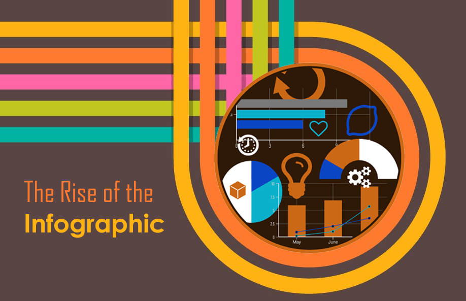
Since infographics are a living proof of the adage “a picture is worth a thousand words” here is an example of an infographic to better define it:

Fun fact: Infographics are reportedly 30 times more likely to be read than text
Why are infographics so popular on social channels and blogs?
A Nielsen Company audience report revealed that adults in the United States devoted about 10 hours and 39 minutes each day to consuming media. The sheer size of available content makes it increasingly challenging to capture our attention.
Bygone is the era where we would bury ourselves into countless books in a quiet library to get our information fix. Today almost all the worlds’ information is literally at the tip of our fingers.
But the massive amount of information available has also greatly shortened our attention spans. There is just too much content competing for our eyeballs on any given time. So content creators realized they must rely on powerful visuals to get a chance to capture their audience’s attention. Hence, the popularity of the infographic: it greatly simplifies our digestion of complex information and has much more attention grabbing capabilities than plain text.
Our brain craves infographics because of the attractive way that information is displayed. Therefore, we tend to view and share infographics at a much higher rate than non-visual data of the same criteria—a table pulled out of excel doesn’t have much potential to go viral—but infographics on the other hand have repeatedly proven that they can easily go viral and bring massive amount of exposure to their publishers. Infographics and social media are simply a match made in heaven.

Evolution of Google searches of the term “infographic” for the past 5 years- Google Trends
How much info does an infographic usually include?
The type and amount of information that can be presented in an infographic is limitless as long as the infographic is easy to understand and doesn’t get the audience overwhelmed or confused. Successful infographics do share some common traits such as covering a narrow topic and explaining it with detail, giving advice, explaining a very specific process, or simply offering information which is captivating.
To better understand infographics lets look at some commonly used formats:
Mixed Charts
A mixed chart infographic format incorporates different chart and graph formats.

Timeline
A timeline infographic format shows how something has evolved over time or tells a story in chronological order.

List
A list format can be mostly text but enhanced by icons, logos and color schemes.

Comparison
A comparison infographic format compares two or more categories side by side. Widely used in cultural, entertainment and business topics.

Maps
A map infographic format displays data across a map. Commonly used to visualize differences between countries or regions.

Single Chart
A single chart format is usually the simplest type of infographic and also the best performing in terms of shares on social media due to its simplicity.

Where can you make your own infographic?
Creating your own infographic can be an almost impossible task if you lack superb design skills. Luckily the Internet has a host of options to help you.
Let’s explore some of these options:
You can use an online infographic maker such as Canva, Piktochart, or Infogram. They have free options and all have pretty intuitive and easy to use frameworks with drag and drop features that do not require design skills. There is a bulk of specialized agencies in the field so it would be difficult to mention which are the best but Lemonly, Killer Infographics, and Infographic World are some of the names that appear at the top of Google search results. The price tag for these services can be pretty hefty but their expertise surely makes up for that.
Of course if you want a custom made infographic a marketing agency such as ourselves—Gate 39 Media—can create these specialized graphics to help communicate your message and get noticed!
Summer is officially in full swing, and that means it's BBQ season. The best cookouts bring together a little bit of everything: crowd-pleasing...


Connect with us to discover how we can help your business grow.
.svg) Contact Us
Contact Us
.jpg)