Design Spotlight: Gate 39 Media’s Lead Designer Nick Landsberger Discusses the Significance of the 2021 Pantone Colors of the Year

Every year, our design team eagerly awaits the big announcement from the Pantone Color Institute on the official Pantone Colors of the Year.
Nick Landsberger, Gate 39 Media’s Lead Designer, reviewed last year’s Pantone color of the year, Classic Blue, as it fit the financial industry like a glove. He outlines the significance of this year’s color selection below.
The idea in earning attention in business isn’t always to blend in or to be “more of the same”. Sometimes it is the unexpected that helps a business positively stand out.
For over 20 years, Pantone’s Color of the Year has influenced product development and purchasing decisions in multiple industries, including fashion, home furnishings, and industrial design, as well as product packaging and graphic design.
The Pantone Color of the Year selection process requires thoughtful consideration and trend analysis. To arrive at the selection each year, Pantone’s color experts at Pantone Color Institute comb the world looking for new color influences.
By keeping our finger on the pulse of color trends, our design team remains informed to help advise on aesthetic decisions with website design customers who turn to us for website design or a re-design of an existing financial, professional, or agricultural services website.
View our website design portfolio here.
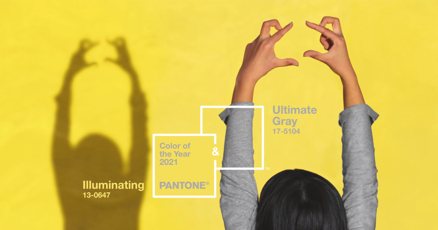
According to Pantone, the official color(s) of 2021 are:
PANTONE 17-5104 Ultimate Gray + PANTONE 13-0647 Illuminating

Ultimate Gray is a common color seen throughout design as the backbone of modern accent colors. It is a true neutral, and soft enough it can work against almost any other color as a secondary. Unlike a standard darker gray – like a metallic or charcoal – Ultimate Gray is much more subtle, yet, with the advancement of modern technology, it can stand alone and still project strength.
With screens becoming sharper and more defined, and color projection becoming almost life-like across nearly all of our everyday devices, Ultimate grey can be used on its own to color bodies of small text, thin lines, or icons to great effect. This is commonly seen in modern digital design as black text on bright white screens can be a bit overwhelming on the eyes.
Ultimate gray lends itself to be a more versatile neutral color selection in today’s best design practices.
Illuminating Yellow works in a similar way as Ultimate Gray. Because it’s a softer tone, our eyes are drawn to its presence but not necessarily overwhelmed as, for example, fluorescent yellow, warning yellow, or construction yellow. It gives whatever it’s applied to a sense of energy and familiarity but also a sense of calm and comfort. It is also a swatch that benefits greatly from modern technology as well.

Our smartphones, LED billboards, and monitors can accurately display Illuminating Yellow’s full vibrancy to an RGB (Red/Green/Blue) state without changing the reaction of the one perceiving it.
As Pantone explains the marriage of the two colors, the combination “conveys a message of strength and hopefulness that is both enduring and uplifting.”
But the pairing has another trait; it’s uncommon.
An unexpected color pairing that also works well in a modern environment is valuable in the way of both form and function. And this can contribute to making a brand memorable.
Striking that perfect balance between effortless and unexpected – how Illuminating Yellow and Ultimate Gray work together – can seem new and exciting to the perceiver. This is what we at Gate 39 Media find is the real strength of 2021 Pantone Colors of the Year.
It’s not always how great a color is, it’s often more important how well it’s used.
Again, my design team and I are always on the watch for breaking trends and color usage that impact the psychology and user experience in website design and development for financial services and agribusinesses.
Have questions about your current color palette or how color influences key calls to action in your website? Connect with us today and let’s explore how aesthetics, colors, and images within your website truly do impact your business’s bottom line.
—
BE SURE TO CHECK BACK AND FOLLOW GATE 39 MEDIA’S #WORKINGREMOTELY SERIES
You may also be interested in:
Editor’s Picks
Lead generation is all about building meaningful connections with the right audience and guiding them toward becoming customers. From first...


Connect with us to discover how we can help your business grow.
.jpg)


![Lead Generation Statistics for 2026 [Infographic]](https://www.gate39media.com/hubfs/Lead%20Gen%20Stats.jpg)