
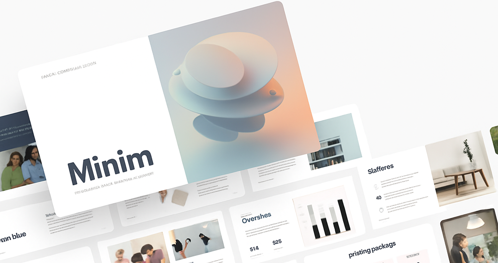
Minimalism in Design: Philosophy Over Aesthetic
Minimalism in design is often mischaracterized as a fleeting trend—a style choice rooted in the desire to mimic Silicon Valley chic. Indeed, brands like Apple, Google, and countless tech startups have popularized sleek, whitespace-driven interfaces that now dominate digital spaces. But to call minimalism a gimmick is to overlook its deeper utility. At its core, minimalism in UX and UI design is not merely an aesthetic—it’s a guiding philosophy.
Beyond the Trend: Function Over Form
At Gate 39, we approach minimalism not as a visual treatment but as a philosophy driven by purpose. The core idea is simple: function must come before form. Design decisions—whether additive or reductive—should serve the user's experience. If minimalism results in a cleaner menu, reduced visual clutter, or sharper focus on key content, it’s doing its job. But if minimalism is applied solely for visual flair, without regard for user needs, it loses its value.
Minimalism, when wielded effectively, becomes nearly invisible. A user doesn't think about the design; they simply navigate with clarity and ease. That invisibility is, paradoxically, the mark of great design.


Design With Intent: Focused Simplicity
Some of the most compelling examples of minimalist design are bold in their restraint. A single line of large text placed over a subtle image background. A vibrant call-to-action button set in a sea of white space. In these cases, the simplicity is not emptiness—it’s precision. Everything that remains on the screen has a purpose.
Rather than relying on logos or branded visuals to carry identity, minimalism encourages the use of subtle brand cues—like accent colors or signature typography. These elements, when applied thoughtfully, support the overall experience rather than competing with it.

Meeting User Expectations
As technology becomes more embedded in daily life, users have come to expect certain design patterns. A food delivery app, a finance dashboard, a photo editor—each has expected layouts, icons, and interactions. Depart too far from those norms, and you risk confusing or frustrating your audience.
Minimalism supports these expectations. Stripping away unnecessary noise it makes interfaces more intuitive, familiar, and efficient. It prioritizes content and functionality, allowing users to focus on the task at hand without distraction.

Versatility Through Simplicity
Minimalism also offers versatility in branding. By reducing reliance on heavy graphics or ornate treatments, brands have more room to highlight content—images, videos, illustrations, and stories that form deeper connections with audiences. A small button can draw more attention when it’s the only colored element in view. A short phrase can feel profound when placed alone in an open layout.
This approach is not unlike film framing, where a single object in a wide shot can feel powerful and intentional. In digital design, space becomes a tool, and minimalism gives brands permission to use it generously and intelligently.


The Subtle Power of Philosophy
Ultimately, minimalism isn’t about making things look clean—it’s about making experiences work cleanly. At Gate 39, we apply minimalist principles to ensure that what we create isn’t just attractive, but usable, purposeful, and adaptable. Whether it’s a marketing page, a digital product, or a pitchbook presentation, our goal is to build with intention—and let the experience speak for itself.
When done right, minimalism doesn’t shout. It whispers just enough to be heard—and that, in design, is often all you need.
Ready to bring clarity and purpose to your digital experiences? Contact us today to start your next design project.
You might also be interested in:
Minimalism in design is often mischaracterized as a fleeting trend—a style choice rooted in the desire to mimic Silicon Valley chic. Indeed, brands...


Connect with us to discover how we can help your business grow.
.svg) Contact Us
Contact Us
.jpg)