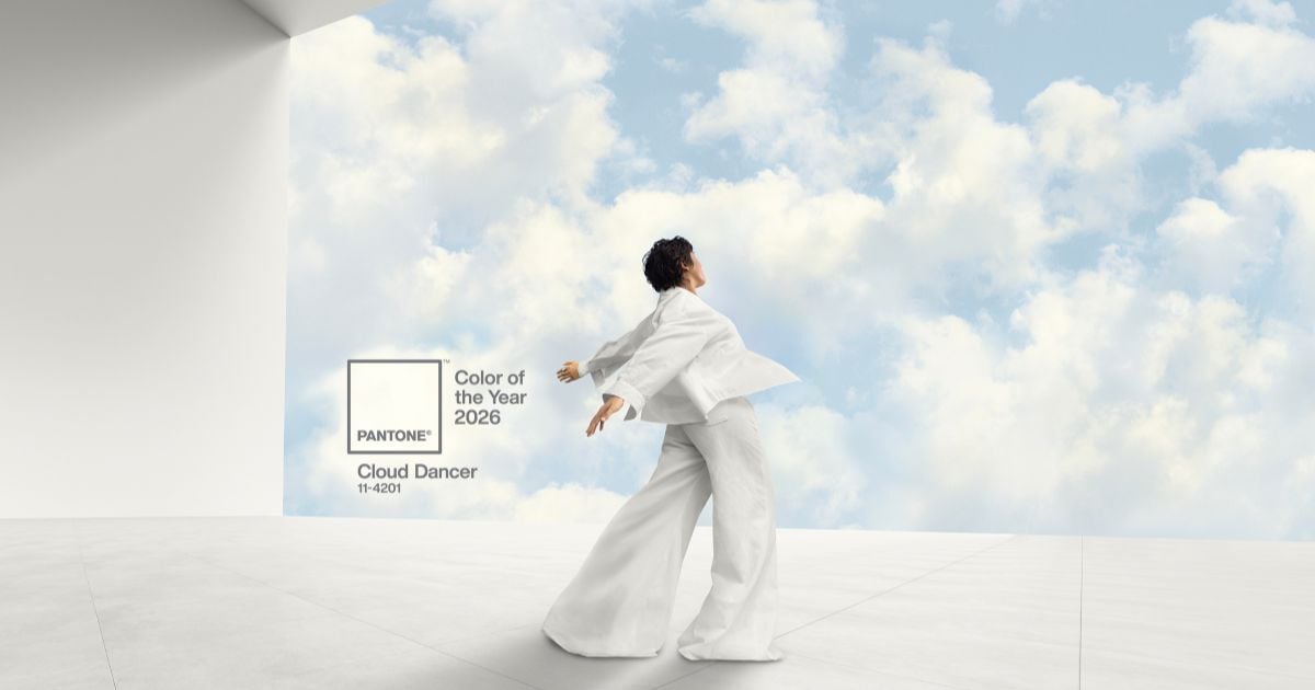
Pantone’s Color of the Year 2026: What Cloud Dancer Reveals About the Future of Design

Pantone’s selection of Cloud Dancer as Color of the Year for 2026 is a curious and, in many ways, paradoxical choice. While white technically qualifies as a color in the physical world—ink, pigment, paint, and material production—it occupies a very different role in the digital design ecosystem. Unlike most Pantone selections, Cloud Dancer does not feel newly introduced or difficult to reproduce. It already exists everywhere.
Historically, Pantone’s authority has been rooted in standardization. Its color system solved a real-world problem: ensuring that brands could consistently reproduce the same hue across physical mediums. Color accuracy mattered because replication was difficult. White, however, resists this framework. In print, in paint, and especially on screens, white does not require careful calibration to exist meaningfully. In digital space, it is the default—emitted by light, defined by absence, and universally accessible through a single hexadecimal value.
This is what makes Cloud Dancer particularly interesting when viewed through the lens of contemporary digital design in the United States. As we begin 2026, the dominant visual language of technology—especially AI-driven products—leans heavily toward dark interfaces, dramatic contrast, gradients, depth, and visual effects. Web experiences increasingly emphasize motion, atmosphere, and dimensionality rather than restraint. Color is no longer decorative; it is structural.
SEE OUR DESIGN PORTFOLIO
Recent developments reinforce this shift. Apple’s latest operating system—still the most widely used mobile OS in the U.S.—signals a clear move toward a “techno-organic” aesthetic. Glass-like materials, translucency, layered depth, and light-reactive surfaces are replacing the flat, white, hyper-minimal interfaces that defined the previous decade. Early minimalism worked because it supported usability at scale, but as users have grown accustomed to ubiquitous technology, visual sophistication has become an expectation rather than a risk.
 Within this context, Pantone’s Cloud Dancer does not align with where digital design is heading—it sits adjacent to it. In a world defined by AI models, microchips, RAM, and computational power, color in the digital realm is cheap. It is infinitely reproducible, unconstrained by material limits. Every screen can produce white effortlessly. The challenge today is not achieving clarity or neutrality, but creating emotion, identity, and distinction in increasingly crowded digital environments.
Cloud Dancer, then, is compelling not because it defines the future of design, but because it contrasts with it. Pantone is not prescribing a direction or advocating a return to minimalism. Instead, the selection highlights a tension between physical color systems and digital design realities—between a world where color once needed guardianship and one where it exists freely as light and code.
Want to explore the influence that colors have on your website? Connect with us today and let’s explore how aesthetics and visuals impact your business’s bottom line.
You might also be interested in:
- 2026 Predictions for Marketing, Tech, and Design Trends
- Design Trends Shaping the Modern Fund Pitchbook
- Mocha Mousse: Blending Familiarity with Modern Design as Pantone’s 2025 Color of the Year
Editor’s Picks
Your website is often the first impression someone has of your brand, and based on that initial interaction, visitors will form an opinion almost...


Connect with us to discover how we can help your business grow.
.jpg)


