

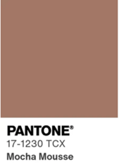
Mocha Mousse: Blending Familiarity with Modern Design as Pantone’s 2025 Color of the Year
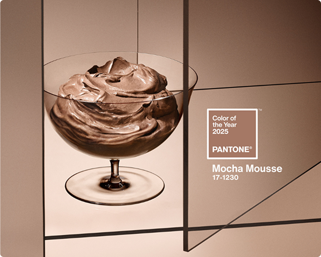
The Gate 39 design team always looks forward to Pantone Color Institute’s annual Color of the Year announcement. Last year, I shared my thoughts on Peach Fuzz, a soft and soothing shade chosen to evoke belonging, recalibration, and a sense of nurturing. For 2025, Pantone has selected PANTONE 17-1230 Mocha Mousse, a warm, earthy tone that feels right at home in today’s design trends. It’s not the kind of color that’s going to shout for attention—it’s more about subtly owning its space, offering personality without being overwhelming.
What is Mocha Mousse?
According to the Pantone Institute:
“PANTONE 17-1230 Mocha Mousse [is] a warming, brown hue imbued with richness. It nurtures us with its suggestion of the delectable qualities of chocolate and coffee, answering our desire for comfort.
With its sophisticated, earthy elegance, PANTONE 17-1230 Mocha Mousse can stand alone or serve as a versatile foundation, enhancing a wide range of palettes and applications—from minimalist to richly detailed designs—across all color-focused industries.”
This color has a natural, human quality to it. It’s reminiscent of skin tones, earthy textures, and the rustic charm of brown paper bags at a farmer’s market. It feels familiar and approachable yet polished and intentional.
Branding Applications of Mocha Mousse
What I like about Mocha Mousse is that it fits seamlessly into so many spaces. It’s soft, earthy, and versatile in a way that doesn’t try too hard but still looks intentional. Unlike bold, attention-grabbing colors like orange (which, for the record, is my favorite), Mocha Mousse is more grounded and understated, making it a great choice for creating spaces that feel warm and inviting without stealing the spotlight.
Some examples of where this color shines:- Interior Design: From wood accents to sleek leather furniture, Mocha Mousse blends sophistication with a grounded aesthetic.
- Fashion: As a neutral canvas, it complements bold patterns or accessories and works just as well in timeless, minimalist looks.
- Cosmetics: It’s perfect for minimalist, nature-inspired packaging. In fact, during a recent trip to Target, I noticed that many brands are already using similar muted tones. Take a look at my pictures below.


In financial services and agriculture branding, it’s best used as an accent color to create depth without taking over. Pair it with navy blue or gold tones, and you’ve got a palette that exudes understated luxury. It’s particularly fitting for wealth management brands aiming for a traditional yet modern feel. Even in tech, where bold and varied color options are more common, Mocha Mousse finds its place. As a neutral, it works as a foundation or contrast for brighter shades. It’s also a great accent in modern web design—think abstract shapes or backgrounds that subtly frame the main content.
SEE OUR DESIGN PORTFOLIO
A Reactionary Choice?
When I first saw this year’s pick, my immediate thought was that it feels more reactive than proactive. Recent Pantone selections have been bold and forward-thinking, but Mocha Mousse feels like a response to what’s already popular—coffee-inspired hues, earthy neutrals in interior design, and the aesthetics dominating social media. That’s not necessarily a bad thing, but it is a noticeable shift.
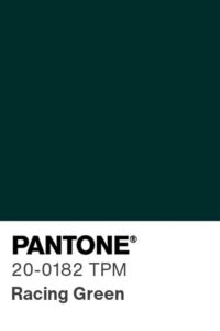 If I had to guess what’s coming next, I’d bet on something that breaks from neutral trends. Racing Green 20-0182, for example, could be a fantastic pick for 2026. It’s a color with heritage, depth, and relevance, especially in the financial world. Brands like Fidelity, TD Ameritrade, and Fisher Investments already use variations of deep green in their branding, and it’s a color that blends history with modernity in a way that’s hard to ignore.
Final Thoughts
Ultimately, Mocha Mousse’s versatility and warmth hit on something we’re all craving—comfort, familiarity, and a little subtlety in a loud world. Whether it’s the foundation of a design or a quiet accent that ties everything together, this earthy tone has a timeless appeal that works across industries. Sure, it might feel like a safer choice compared to previous years, but its adaptability and understated elegance make it anything but forgettable.
Have questions about your current color palette or how color influences key calls to action on your website? Connect with us today and let’s explore how aesthetics, colors, and images within your website truly do impact your business’s bottom line.
You might also be interested in:
- 2025 Predictions for Marketing, Tech, and Design Trends
- 3 Essential Questions to Define Your Brand Identity
- Design Spotlight: Warming Up to Pantone’s 2024 Color of the Year – Peach Fuzz
If you’ve used ChatGPT or another AI tool recently, you already know it can be impressive. Type something in, get something back, move on with your...


Connect with us to discover how we can help your business grow.
.svg) Contact Us
Contact Us
.jpg)